Julie Ucha's Portfolio

Design Work


Company Identity Marks

Horizontal_Book_Mockup_2.jpg


In an exercise in logo branding and design, I decided to remake the logos of 10 companies; all ranging in different fields. I wanted to start the process from scratch and see when my designs would take me. In the end, I finished with a book of 10 completed rebranded logos for these companies.

If you wish to see the entire PDF in full, click here.


Culture’s Mirror: Comedy

Book Cover Mockup.jpg
 
thumvnails.PNG
 

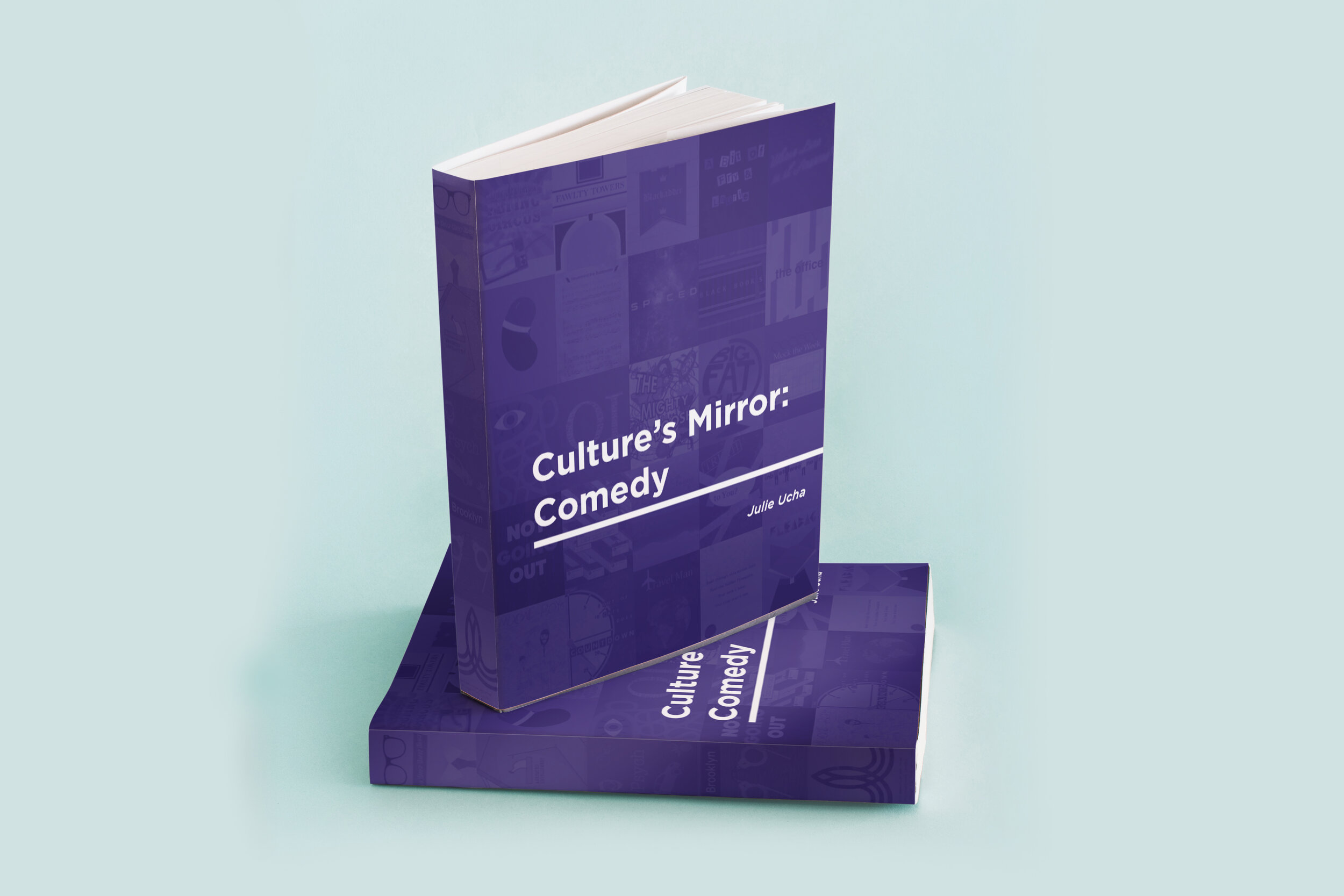
In this project, I wanted to combine two of my personal loves; design and comedy. I have always been fascinated by the difference in American vs British comedy. I picked 25 American and British comedy shows and made new posters for every one. While doing this, I tried to show the comedy style within my design or, at least, show the aesthetic of the show.

These 50 posters, compiled with my own writings about each of the shows, amounts to my biggest design project to date. If you want to view the entire book, click here.

 
portrait copy.jpg

Self Portrait

As another digital illustration, this project was to make a self portrait. I took a picture of myself and traced a vague outline of my hair, face, and shirt. From there, I went section by section adding different highlights and lowlight to my face as well as other feature I may have missed in the rough outline. I constantly went back and kept adding more and more diverse colors to make my face and features even more defined until I ended up with this final result.

 
Hayley's Logo.PNG

Hayley’s Classic Rock Block Logo

I designed this logo for a radio show at the Lewis University Radio Station, WLRA. The show showcases classic rock and I wanted to showcase a similar feel in the logo.

 
Hayley's Logo Shirt.PNG

Hayley’s Classic Rock Block Shirt

A continuation of the last image, this is what the merchandise looked like with the above logo added onto it. The merch was in short supply, but the logo fit very easily into a merch format.

 
Music Illustration.jpg

Music Illustration

Based heavily on the music of ELO (Electric Light Orchestra), I designed this music poster. It’s an abstract space design with elements of musical instruments thrown in. The beams/lasers and planets all come to mind when listening to this band’s music, so I felt that they needed to be included.


Payroc Internal Designs

Here are a few of the designs I made for internal use during my time at Payroc. There were television monitors in all of our locations around the world and my designs would be displayed to keep all of our offices connected to what was happening in the company

 
IMG_1212.jpg

Budingen Bench

As one of the few physical entries in this portfolio, This is a bench I designed and painted for my town’s annual art installation. Artists from the town come together and create benches that all match a certain theme. This theme was “All Around the World”. I decided to create a bench for Budingen, Germany, which is our sister city.


The Wall Bench

Based on Pink Floyd’s Album The Wall, this is the second bench I created for my town’s annual art installation. This year’s theme was “Album Cover Tour”. I chose to do The Wall since it is one of my all time favorite albums.

 
the albums seventies.jpg

Old Soul Zine Spread 1

I created a zine called “The Old Soul Zine”. The overall premise was that it would be a compilation of all things classic rock. In this specific issue, I focused in on 1970’s England and everything that was happening in the music scene then. This spread looks at the top albums from each year. I researched which albums were at the top of the charts for the longest amount of time.

 
Old Sould Zine-1.jpg

Old Soul Zine Spread 2

In this spread from the zine, I researched all of the best selling singles of the decade in England. This infographic shows how many millions of copies each single sold during that decade.

 
Metra Safety Poster.jpg

Metra Safety Poster

This design was made for the Metra Safety Poster contest held by the Metra Train company. I received an honorable mention for my work among others in my age range.

 
dvd illustration copy copy.jpg

Forrest Gump Poster

Created for a redesign project using digital illustration, I designed a new poster for one of my favorite movies, Forrest Gump. I incorporated aspects of Forrest’s life that are shown throughout the movie including a Dr. Pepper soda, a football, a feather, and, of course, a box of chocolates.

 
two men 1.jpg

The Old Man and the Bridge Cover 1

Another redesign project where we had to take the source material and create something new. For this one, it was reading the short story “The Old Man and the Bridge” by Ernest Hemingway and making a new cover for the story. Since it is about the trauma that a man feels having just returned from his service vin the war, I wanted to exemplify that feeling and how it contrasted with the man sitting next to him.

 
dove.jpg

The Old Man and the Bridge Cover 2

The second, and final, cover of the “The Old Man and the Bridge” by Ernest Hemingway. This was the cover that I turned in for the project. It showcases a dove whose symbolism in the story was to show peace in the world, even if the man didn’t see it at the time.

 
ruth may fox.jpg

Ruth May Fox Poster

This is probably the piece that took the least amount of time in this entire portfolio. My teacher tasked us with a design experiment. He assigned everyone to a famous activist and told us that we had half an hour to design a poster for that person. This was my result.

Motion Graphics

 
Screen Shot 2019-05-09 at 7.28.04 PM.png
 
Screen Shot 2019-05-09 at 7.34.04 PM.png

Stranger Things New Intro

This is a reimagining of the Stranger Things Intro. This was done for class as an exercise in Motion Graphics. This is something that I am very proud of and continue to show because I am passionate about entertainment and design, and both of those are showcased in this piece.

Watch it here


DePaul Film Festival

Here is an example of the work I did for the DePaul Film Festival. There were 20 clips in all with each one being about 5 seconds long. Each clip would play before the winner of each category was announced, giving a nice title card for the presenters of the awards.

watch it here